Strategy
- Vision Fest Planning Session
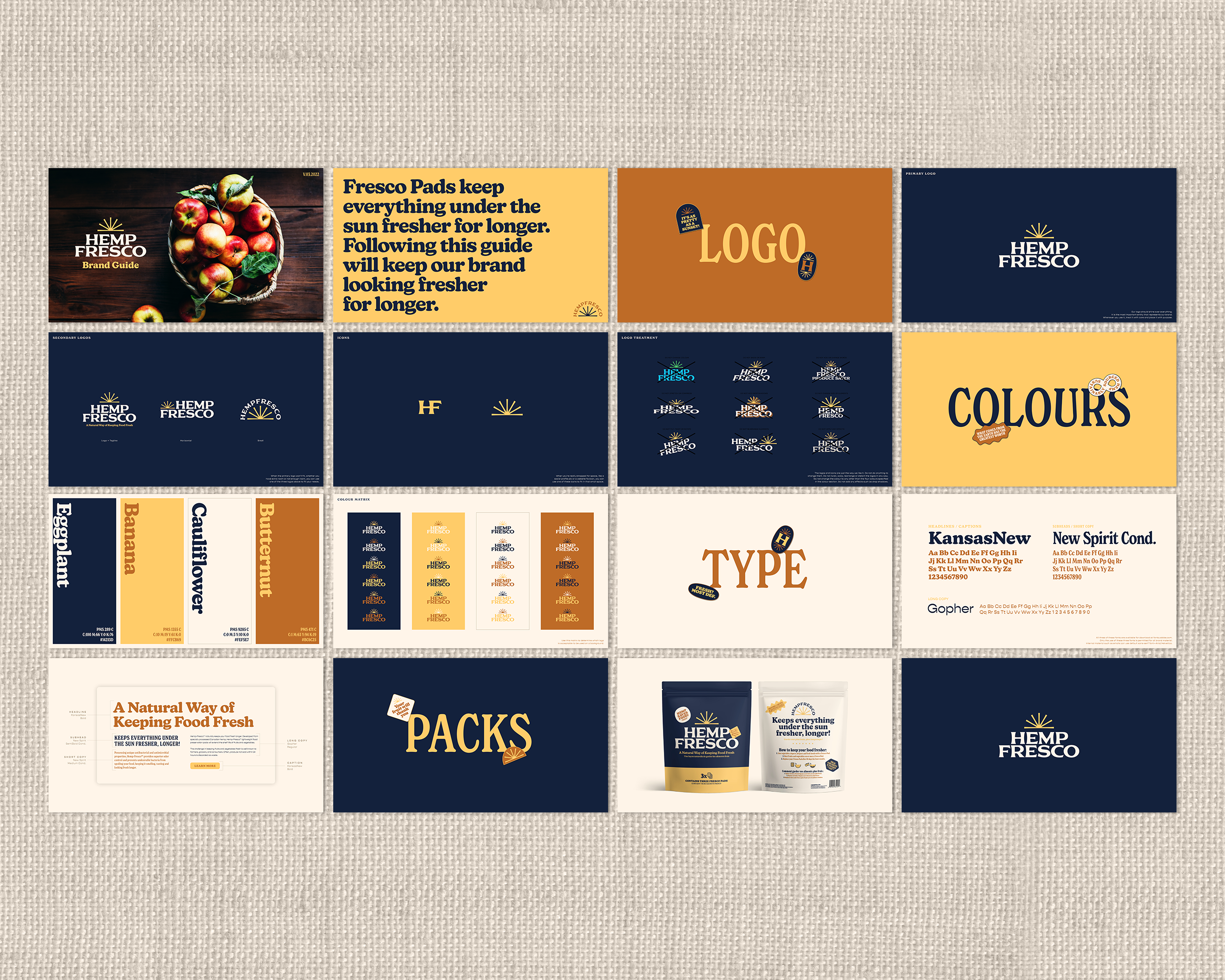
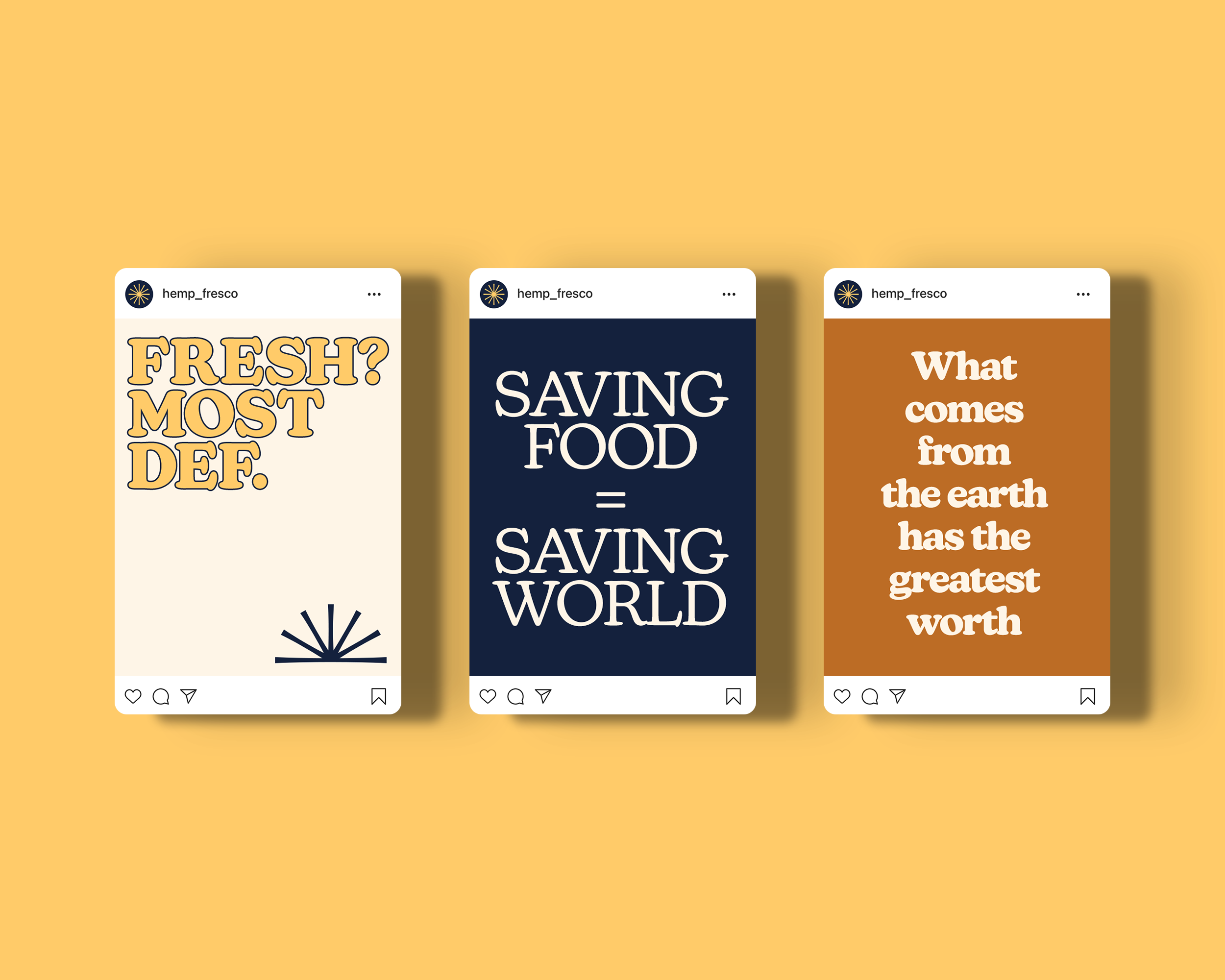
Creative
- Logo and brand development
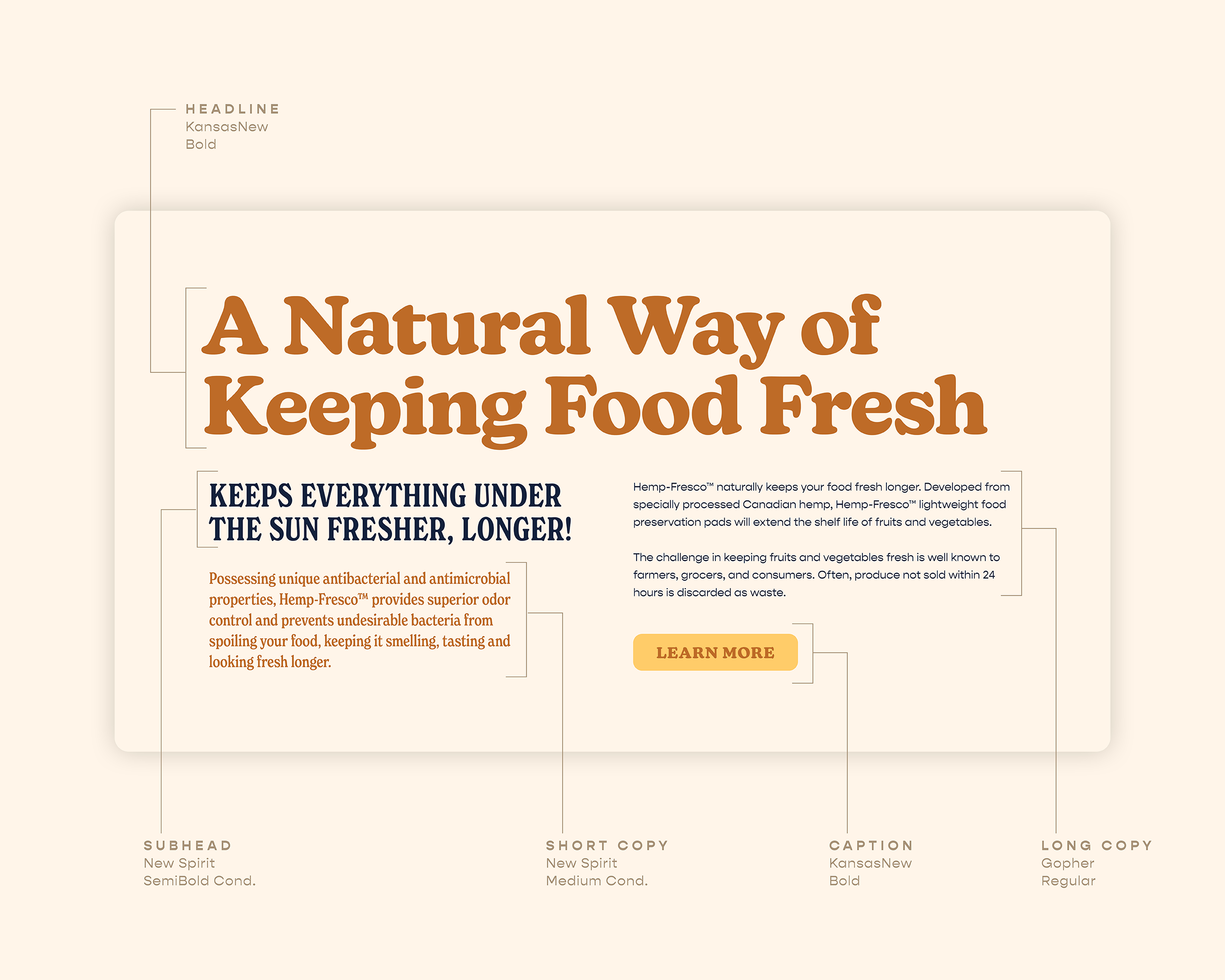
- Copywriting (English and French)
- Packaging design
Challenge
Elevating Hemp-Fresco’s Brand and Packaging for Consumer Trust
To achieve the coveted “Kleenex effect,” we recognized the need to amplify what sets Hemp-Fresco apart. The brand and packaging faced a dual challenge: to captivate shoppers with an appealing design and then guide them through the buying journey, clearly conveying the product’s significance, functionality, and reasons to purchase. As a pioneering food preservation solution, Hemp-Fresco had the opportunity to cultivate a devoted following and become synonymous with freshness preservation.
Solution
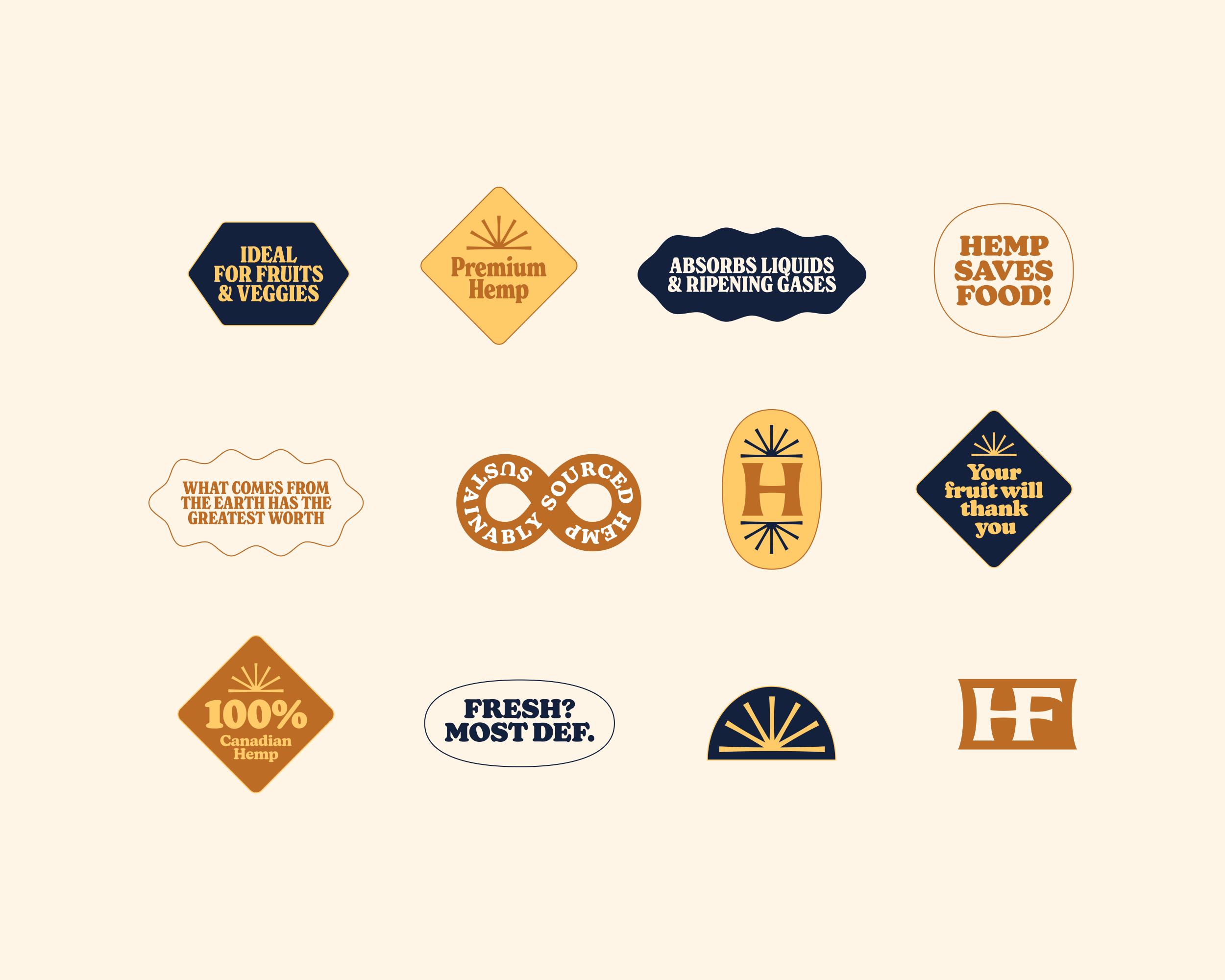
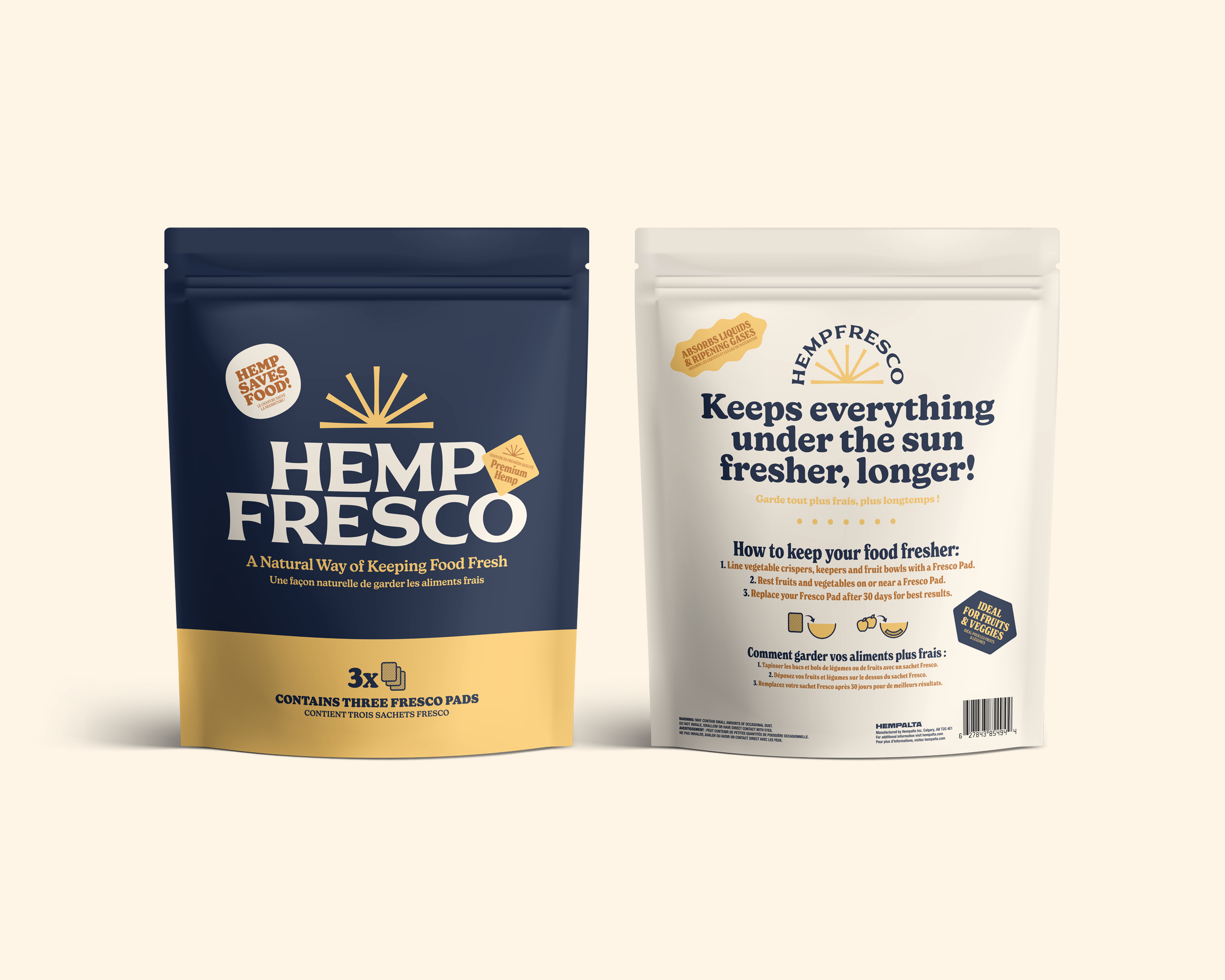
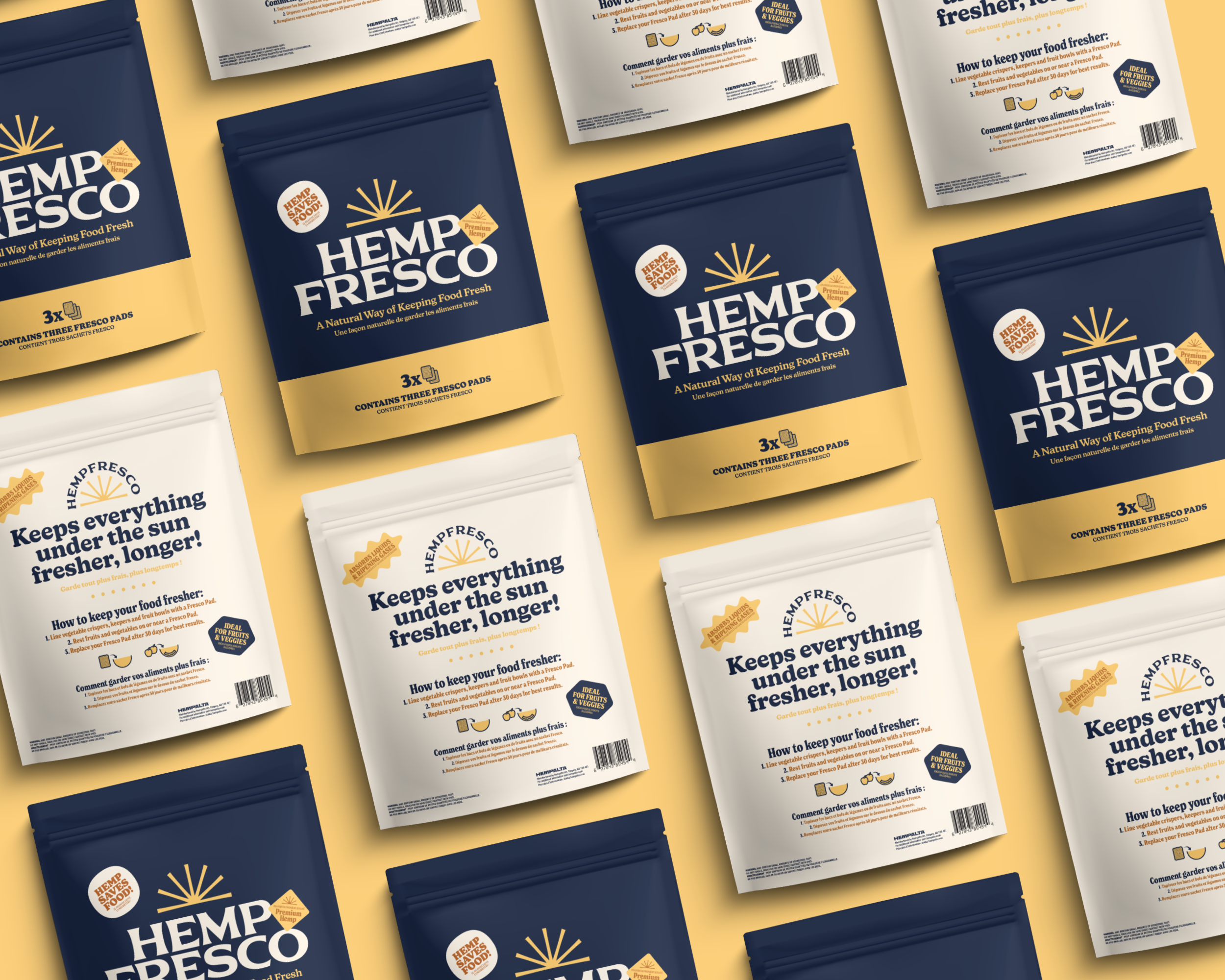
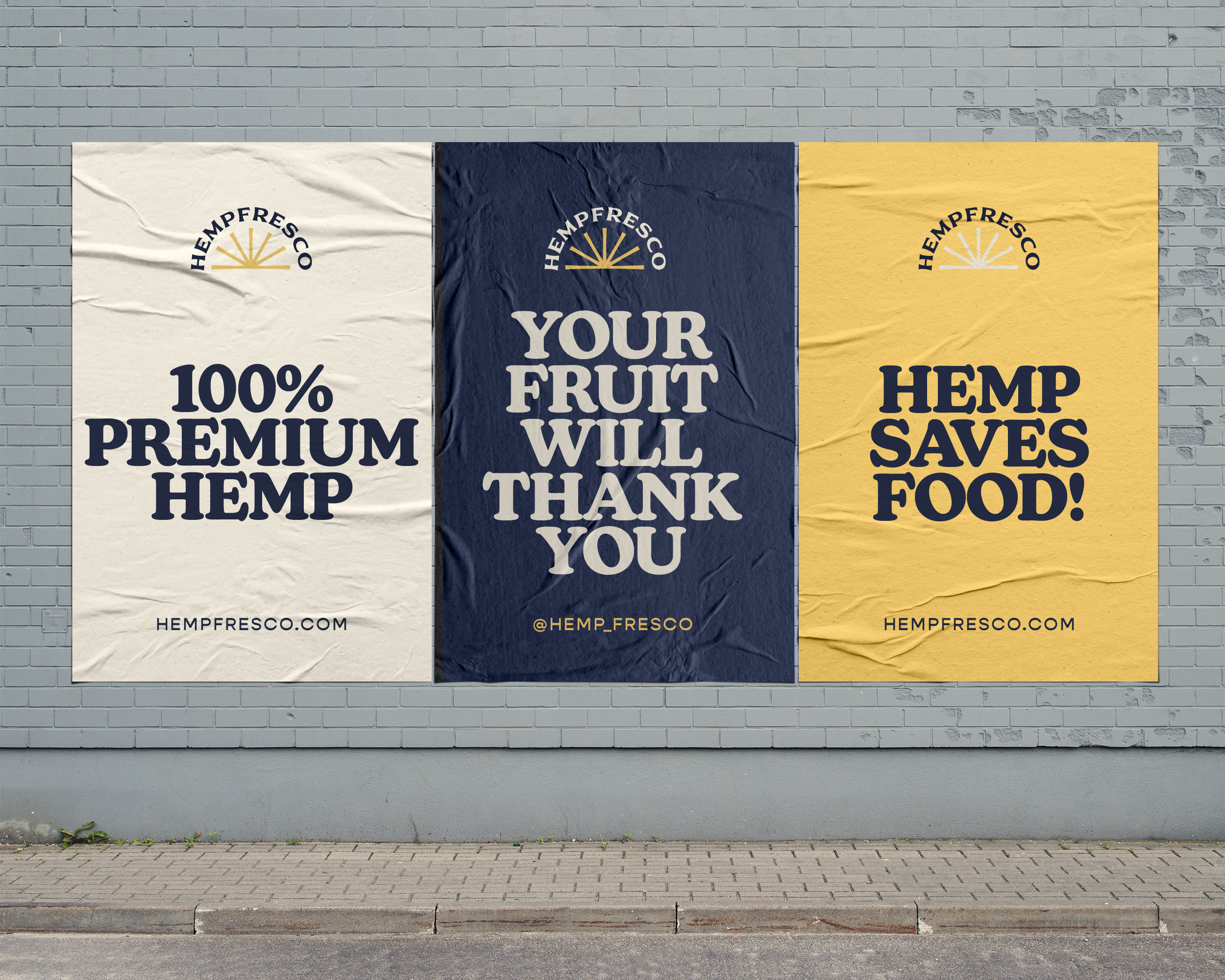
The Sun-Centered Brand Identity
Hemp-Fresco isn’t merely a food preservation tool; it’s a life giver. Its ability to extend the lifespan of fresh produce holds the potential to enhance lives, reduce food waste, and impact the world. We sought a symbol that truly encapsulated this life-enhancing capability, leading us to the sun, a universal source of life and prosperity. The sun took center stage in Hemp-Fresco’s brand identity, signifying its life-giving properties. Combining the sun’s rays with the seven fan leaves of the hemp plant paid homage to the plant powering this revolutionary product.
Results
Empowering a Symbolic Shift in Food Preservation
The redesigned brand and packaging transformed Hemp-Fresco into a beacon of consumer trust, effectively conveying its unique value and potential to make a meaningful difference. The sun-centered brand identity not only caught the eye but also resonated with consumers, symbolizing the life-giving ability of this pioneering product and its capacity to change the world.